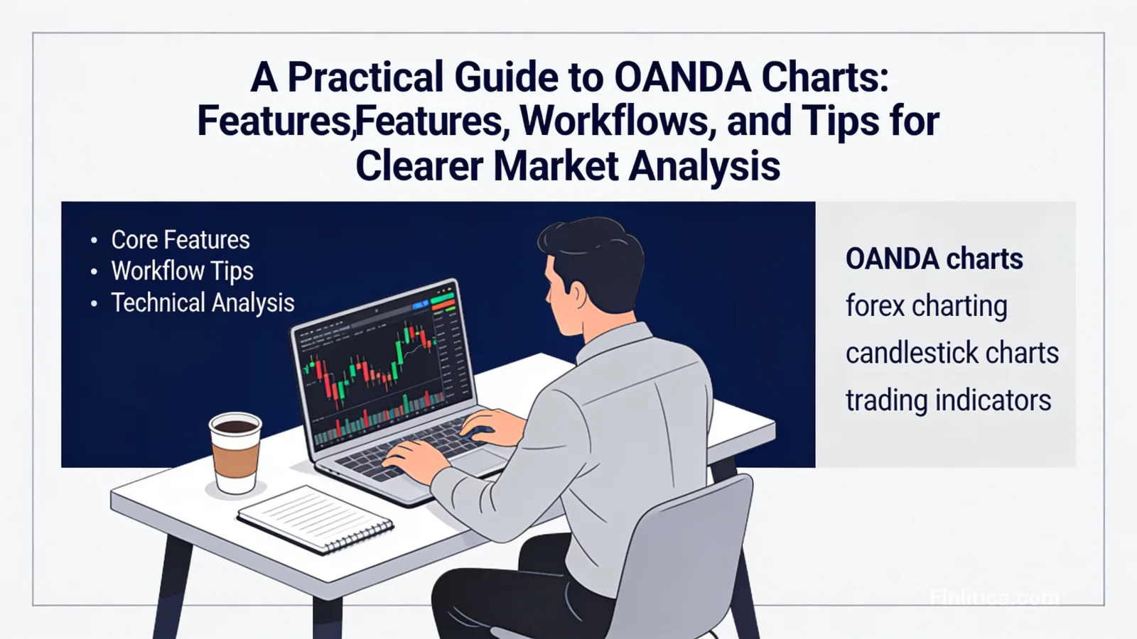
A Practical Guide to OANDA Charts: Features, Workflows, and Tips for Clearer Market Analysis
Learn how to use OANDA charts effectively for forex and CFD market analysis. Explore core features, chart types, indicators, drawing tools, templates, and practical workflows. Get tips on customizing layouts, reading candlesticks, managing timeframes, and avoiding common pitfalls, plus answers to frequently asked questions.
Clear, reliable charts can make the difference between a rushed reaction and a measured decision. OANDA charts offer a familiar, flexible environment for analyzing price action across currencies and other instruments, with tools that suit quick checks and deeper technical workflows alike. This guide explains what OANDA charts provide, how to read them efficiently, and practical ways to organize indicators, timeframes, and layouts so your analysis remains consistent and repeatable.
What Are OANDA Charts?
OANDA charts are the interactive charting panels available within OANDA’s trading ecosystem, designed to visualize market prices over time. They typically support multiple chart types, timeframes, drawing tools, indicators, and layout customization. Traders often use them to study trends, identify support and resistance, measure momentum, and align trade plans with broader market context.
While they can serve a wide range of strategies, their primary value is in presenting clean, timely price data in a format that is easy to configure and compare across instruments.
Core Features and Why They Matter
Chart Types and Visual Clarity
- Candlesticks: Commonly used for visualizing open, high, low, and close with color-coded bodies that highlight directional bias and intraperiod volatility.
- OHLC/Bar: A compact alternative to candles, with tick marks indicating open and close; helpful for users who prefer a minimalist view.
- Line and Area: Useful for a streamlined perspective on closing prices; often favored for high-level trend views or quick checks.
Timeframes for Multiple Perspectives
- Intraday: Minutes-based intervals help track short-term structure and momentum shifts.
- Daily/Weekly: Higher timeframes filter noise, offering a broader picture of trend and key levels.
- Multi-timeframe Review: Many users confirm a hypothesis on a higher timeframe and refine execution using a lower timeframe.
Technical Indicators
- Trend: Moving averages and related overlays help smooth price and identify directional bias.
- Momentum: Oscillators like RSI or MACD can highlight potential overbought/oversold conditions or divergence.
- Volatility: Average True Range (ATR) or Bollinger-style bands contextualize expansion and contraction in price ranges.
- Volume Proxies: In decentralized FX markets, tick volume can provide a sense of activity, though it differs from centralized exchange volume.
Drawing Tools and Annotations
- Horizontal Levels: Mark support, resistance, and psychological round numbers.
- Trendlines and Channels: Visualize directional structure and potential breakout or mean-reversion zones.
- Fibonacci Tools: Estimate proportional retracements or extensions to frame scenarios.
- Text and Shapes: Keep notes, hypotheses, and session markers visible for later review.
Templates, Layouts, and Sync
- Indicator Templates: Save commonly used settings (e.g., moving average lengths, oscillator bounds) to speed up analysis.
- Multi-Panel Layouts: View correlated instruments or different timeframes side by side for context.
- Color Themes: Adjust contrast for long sessions; consistent colors reduce interpretation errors.
How to Read OANDA Charts Efficiently
Understand Price Bars and Candles
Each bar or candle captures the open, high, low, and close for a chosen interval. Long bodies suggest stronger directional conviction during that interval, while long wicks can indicate rejection near extremes. Clusters of narrow-range bars may signal consolidation before a potential expansion.
Distinguish Bid, Ask, and Mid
FX quotes are typically shown with bid and ask prices. Knowing the difference helps you understand where trades might execute relative to the visible price line. When possible, annotate charts with both to avoid confusion when measuring levels.
Context First, Detail Second
Start on a higher timeframe to define trend, key levels, and volatility regime. Then step down to refine the view. This top-down process prevents overreacting to lower-timeframe noise and supports consistency in decision-making.
Practical Workflows for Technical Analysis
Top-Down Trend Assessment
- Weekly/Daily: Identify primary trend and structural levels (swing highs/lows, zones of interest).
- 4H/1H: Look for alignment or divergence with the higher timeframe trend.
- 15M/5M: Pinpoint areas where price may react, then observe price behavior for confirmation signals that fit your rules.
Momentum and Mean Reversion Checks
- Momentum Confirmation: If price breaks a level with rising momentum readings, it may suggest continuation risk.
- Reversion Conditions: Extended moves into bands or extremes on oscillators can highlight areas to be cautious or to watch for stabilization.
Volatility Framing
- ATR-Based Context: Compare current ATR to recent history to judge whether recent moves are unusually large or small.
- Range Mapping: Identify session ranges; consolidations can precede expansions, while expanded ranges may revert to mean activity.
Support, Resistance, and Reaction Zones
- Mark Levels: Use horizontal lines at prior swing points or areas with multiple touches.
- Validate with Price Behavior: Wicks, closes beyond levels, and multi-bar tests can add weight to a zone’s relevance.
- Scenario Planning: Note alternate outcomes (break-and-hold vs. rejection) to reduce bias.
Customization Tips for Cleaner Charts
- Limit Indicator Count: Focus on a small, complementary set to avoid conflicting signals.
- Color and Line Weight: Make primary levels bold and secondary levels subtle; avoid overly bright palettes.
- Consistent Templates: Apply the same templates across instruments so patterns are easier to recognize.
- Annotation Discipline: Date your notes and use concise labels to track ideas over time.
Data, Reliability, and Settings to Review
- Data Source and Time Zone: Confirm the time zone and session markers align with your routine to avoid misreading session highs and lows.
- Chart Updates: Ensure auto-refresh is enabled and your device time is accurate.
- Spread Awareness: Remember that bid-ask spreads can affect where levels are actually touched or orders might fill.
- Session Boundaries: If you analyze by sessions, annotate start/end times for clarity.
Use Cases: From Quick Checks to Deep Dives
Quick Market Scan
- Open a multi-chart layout with a few core instruments and a higher timeframe to spot broad conditions.
- Flag instruments approaching key levels; add notes for later review when liquidity is higher.
Structured Strategy Review
- High-Level Context: Weekly/daily to frame directional bias and volatility backdrop.
- Setup Validation: Intermediate timeframe to confirm structural patterns or momentum posture.
- Refinement: Lower timeframe to observe how price interacts with levels before considering next steps.
Post-Session Debrief
- Screenshot or Save Layouts: Compare planned scenarios with what occurred.
- Tag Missed Moves: Note whether entry criteria were too strict or too loose.
- Adjust Templates: Incrementally improve clarity rather than overhaul everything at once.
Common Pitfalls to Avoid
- Overfitting Indicators: Adding too many tools can create conflicting signals and decision paralysis.
- Ignoring Higher Timeframes: Focusing solely on low intervals increases the risk of misreading the broader trend.
- Neglecting Spreads and Wicks: Level tests that miss by a small margin may still be meaningful; account for bid/ask differences.
- Inconsistent Settings: Changing colors, scales, or indicator parameters frequently makes pattern recognition harder.
Actionable, Non-Promissory Best Practices
- Document Your Chart Rules: Define what constitutes a level, a trendline break, or a momentum confirmation in your own terms.
- Standardize Your Multi-Timeframe Routine: For example, top-down every morning, refinement later, and a debrief after the session.
- Use Alerts Thoughtfully: Alerts on levels or indicator thresholds can reduce screen time and help maintain discipline.
- Review Periodically: Compare outcomes across weeks to ensure your templates still serve your process.
FAQ: OANDA Charts
What instruments can I analyze on OANDA charts?
Typically, you can chart major and minor currency pairs and, depending on your account type and region, a selection of other instruments. The exact list may vary by jurisdiction and product availability.
Do OANDA charts support multiple indicators at once?
Yes. You can usually add several indicators and overlays, then save them as templates for faster reuse across instruments and timeframes.
Can I save custom layouts and templates?
In most cases, you can save indicator sets, color themes, and multi-panel arrangements, then load them later to maintain consistency in your workflow.
How accurate is tick volume on OANDA charts?
FX tick volume is a proxy for activity and does not represent centralized exchange volume. It can still offer useful context for relative changes in market participation.
What is the best timeframe to use?
There is no universal best timeframe. Many users start with a higher timeframe to establish context and then use a lower timeframe to observe price behavior in more detail.
Can I set alerts on OANDA charts?
Alerts are often available for price levels or indicator conditions. They can help you track key events without continuously watching the screen.
Are OANDA charts suitable for beginners?
They are generally approachable, with intuitive tools and templates. Beginners can start with simple layouts and add complexity as they develop a process.
How do I avoid clutter on my charts?
Limit the number of indicators, prioritize essential levels, standardize colors and line weights, and keep concise annotations.
Do OANDA charts show both bid and ask prices?
They can display bid and sometimes ask or mid depending on settings. Enabling multiple lines where available helps you interpret price interactions with levels more precisely.
Can I compare multiple instruments side by side?
Multi-panel layouts allow you to view several instruments or timeframes simultaneously, which is helpful for correlation checks and context building.
Conclusion
OANDA charts provide a flexible, approachable environment for market analysis. By focusing on clean chart types, consistent templates, and a disciplined multi-timeframe routine, you can reduce noise and enhance clarity. Use indicators sparingly, annotate deliberately, and review your process regularly. Over time, this structure helps turn raw price data into actionable insights without overcomplicating the view.